Dekkers brandbook

Een eenduidige huisstijl draagt bij aan een zichtbaar en herkenbaar Dekkers. Binnen de huisstijl van Dekkers zijn er vijf eigenschappen die het gezicht bepalen: logo, typografie, kleurgebruik, fotografie en taalgebruik. Deze handleiding laat zien wat de bouwstenen zijn waarmee een ontwerper en tekstschrijver aan de slag kunnen gaan om naar eigen inzicht middelen te creëeren.

Vragen?

Deze huisstijl is ontwikkeld door ZUID Creatives. Vragen over de huisstijl? Neem contact op via info@zuid.com of bel 013-545 03 23.

Logo

Logo gebruik

Als minimale afstand van logo tot andere elementen houden we de D uit de brandicon aan.

Dit kun je aanhouden voor het logo met payoff én zonder payoff. Ook voor het brandicon houden we deze afstand tot andere elementen aan.

De sparks van Dekkers. 
Dekkers. Zonder international. Maar met oog voor de toekomst.
We behouden het groen. Want dat geeft ons dynamische, innovatieve karakter weer. We houden ervan om oplossingen te bieden waar onze partners écht iets aan hebben. Niet meedenken. Maar verder denken.
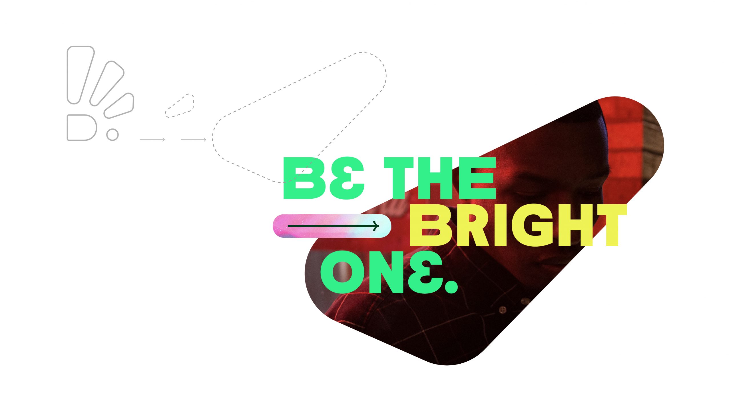
Dekkers. Be the bright one.

De sparks staan voor:
Power: we zijn een bedrijf met daadkracht
Slim: wij bedenken slimme oplossingen
Veelzijdig: onze veelzijdigheid maakt ons uniek
Dynamisch: snel schakelen, creativiteit en pragmatisch

Favicon


De favicon
gebruiken we in dichte vorm. De favicon wordt klein gebruikt, als we de vorm open houden valt de belijning weg. Daarom kiezen we er in klein gebruik voor om de brandicon dicht te maken.

E-mail handtekening

De E-mail handtekening is te gebruiken met een witte achtergrond of een donker groene achtergrond.

Typografie

Neighbor Black

Gebruiken we in titels in kapitalen

Line height

Font size tussenkop size x 2
Interlinie: 79% van fontsize

ACTIVATE font >> Do it!

Work Sans Bold

Gebruiken we in in tussenkoppen.

Line height

Font size x 1.1

Work Sans Regular

Gebruiken we in bodycopy.

Line height

Introductions = Font size x 1.1

Neighbor Regular

Gebruiken we voor onze payoff.

Kleuren

Groen

Groen is onze hoofdkleur.

HEX: #003D18
RGB: R 0 / G 61 / B 24
CMYK: 92 / 47 / 97 / 59
PMS: 343 C

Felgroen

Onze secundaire kleur.
Je mag deze kleur gebruiken om het logo in weer te geven.

HEX: #00F47E
RGB: R 0 / G 244 / B 126
CMYK: 75 / 0 / 75 / 0 (Let op: minder fel dan RGB!)
PMS: 7479 C

Geel

Geel is onze tertiaire kleur.
Deze kleur gebruiken we voor accenten en soms als achtergrondkleur.

HEX: #EEF320
RGB: R 238 / G 243 / B 32
CMYK: 10 / 0 / 90 / 0
PMS: 3945 C

Wit

Wit gebruiken voor teksten en accenten.

HEX: #FFFFFF
RGB: R 255 / G 255 / B 255

Stijlelementen

Impressie van hoe onze visuele identiteit is opgebouwd

Grafisch element

Het beeldmerk, de Spark, gebruiken we om toe te passen als grafisch stijlelement binnen de identity.

Door de elementen die samen de Spark vormen uit elkaar te halen, te vergroten en individueel te positioneren binnen een layout ontstaat een karakteristieke vormgeving. De organische vlakken kunnen zo op een speelse manier toegepast worden.

Het beeldmerk mag daarvoor gedraaid en gespiegeld worden.

Op deze manier zijn er vele mogelijkheden om te variëren binnen een eenduidige identiteit.

Patroon

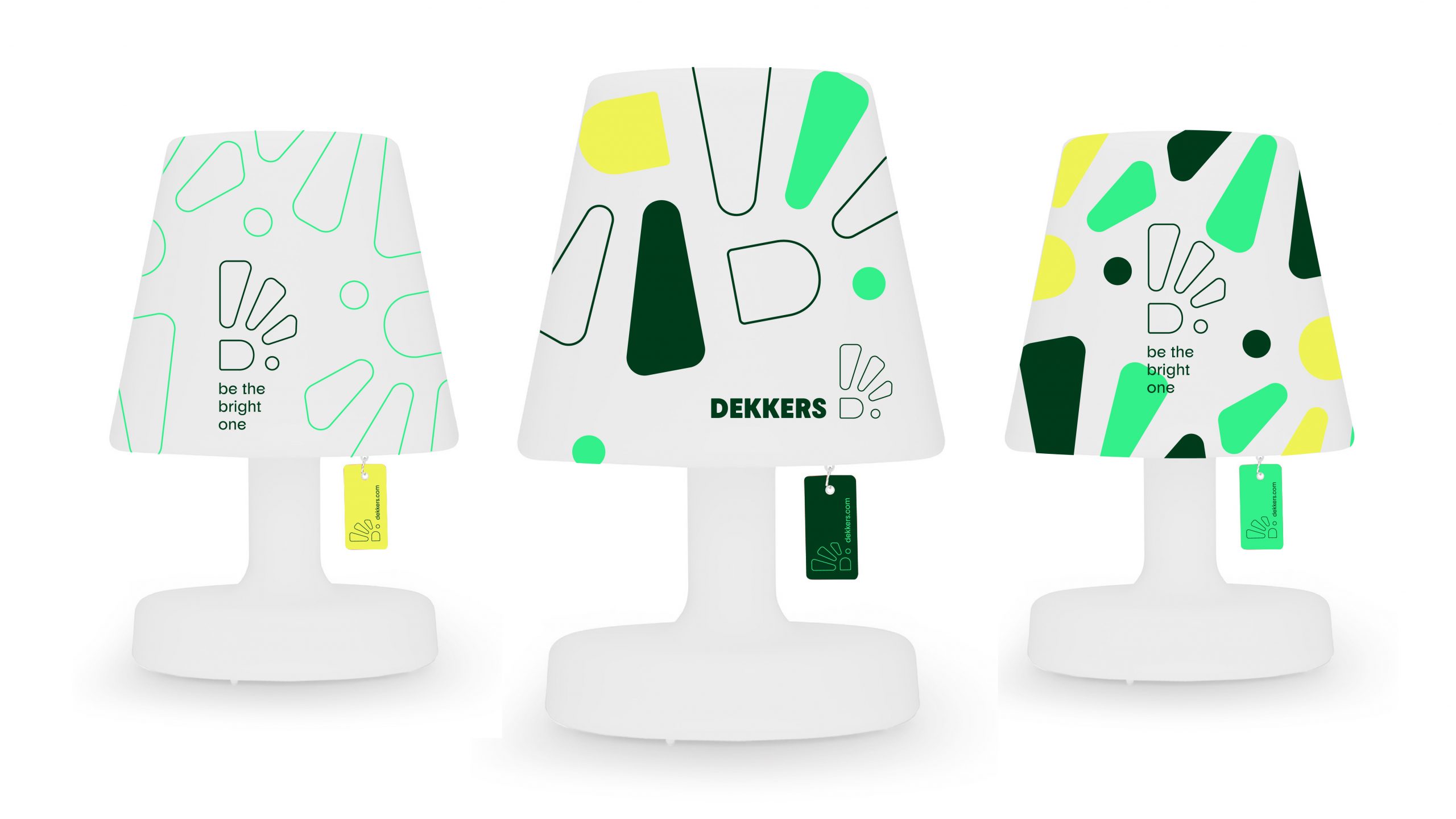
Met de Spark hebben we een patroon ontwikkeld die we op verschillende manier kunnen inzetten. Als patroon op volvlakken groen of felgroen.
Wil je het patroon iets meer upspicen? Dat kan. Je mag spelen met de vorm door afwisselend de spark invulling te geven met een van de Dekkers kleuren.

Extra element

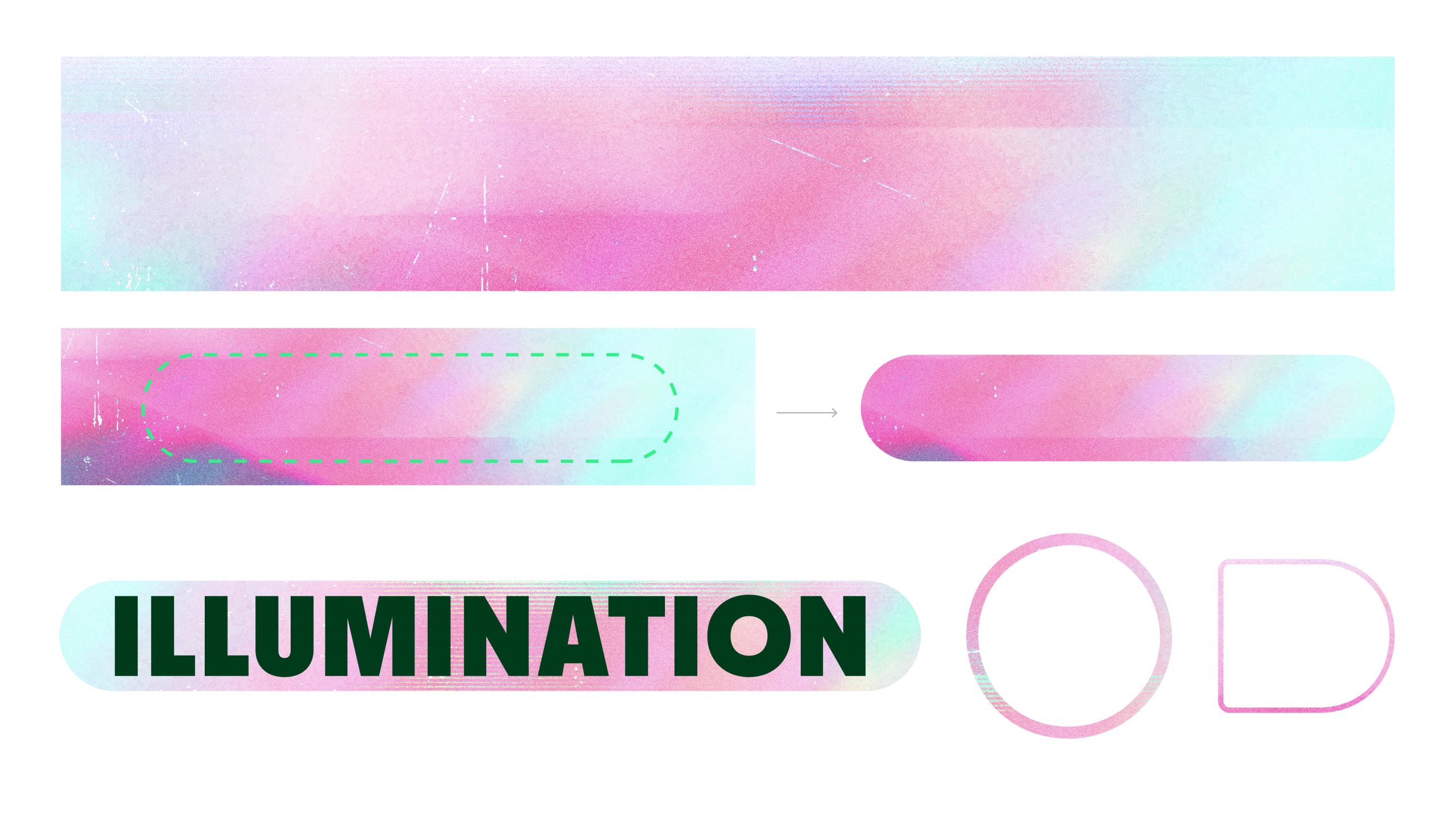
Naast de Spark gebruiken we soms een extra element. Bestaande uit een structuur ingesloten in een vorm. We laten een aantal voorbeelden zien.

Visitekaartje

In de download link vind je het open bestand van het visitekaartje.
Vul deze naar de juiste gegevens in. Exporteer het visitekaartje naar de wensen van de gekozen drukkerij.

Download

Schrijfwijzer

Een schrijfwijzer die schrijven een stuk fijner maakt.

General
Dekkers’ brand voice balances professionalism with approachability, emphasizing our expertise while maintaining a friendly tone. As specialists with over 30 years of experience, we communicate with confidence and authority, particularly in our roles as advisors in “brand illumination”, marketing, and sustainability. Our primary focus is on delivering clear, concise, and valuable information to our audience – primarily marketers and brand managers. We address them as knowledgeable peers, offering expert insights and solutions without resorting to unnecessary jargon. While we maintain a hint of warmth in our tone, we prioritize our professional image and the depth of our expertise. In our daily communication with clients, we adopt an advisory role, showcasing our extensive experience and commitment to their success. Our goal is to build trust and demonstrate thought leadership through informative, engaging communication that occasionally incorporates subtle wordplay or a light-hearted “wink” to keep the tone warm and relatable and to show a little of Dekkers’ personality without compromising on our professionalism.

Do’s

  1. Use confident language that reflects our expertise.
  2. Maintain a professional tone while being approachable and relatable.
  3. Provide clear, concise information and valuable insights.
  4. Use subtle wordplay or light humor when it genuinely adds value to the message.
  5. Emphasize our 30+ years of experience and specialist knowledge.
  6. Address the audience as knowledgeable peers.
  7. Focus on our advisory role in brand illumination, marketing, and sustainability.
  8. Use industry-relevant metaphors to explain concepts.
  9. Highlight our commitment to sustainable practices.
  10. Tailor the level of formality to the specific communication channel and audience.

Dont’s

  1. Use overly casual or informal language that could undermine our professional image.
  2. Overuse humor or try too hard to be clever or funny.
  3. Use jargon or technical terms without explanation when unnecessary.
  4. Make claims without backing them up with our expertise or experience.
  5. Adopt a condescending tone or talk down to our audience.
  6. Use slang, trendy expressions or memes.
  7. Neglect to mention our extensive experience when relevant.
  8. Use overly complex language when simple terms suffice.
  9. Forget to emphasize the value we bring to our clients.
  10. Use humor in sensitive situations or when discussing serious topics.
  11. Use unnecessary emojis or smileys when talking to clients.

Headers
Start headings in presentations or on the website with a capital letter and continue with lower case letters. You do not have to end a heading with a period. This way, the heading reads better and looks friendlier.

Yes to:Content that stands out, sticks and is shared
No to: CONTENT THAT STANDS OUT, STICKS AND IS SHARED
And also not: Content that stands out, sticks and is shared.


Active writing
Avoid supporting verbs
(become, should, should, can, must, seem, may, seem, will).


Active writing

Don’t:
The sign will be delivered by us to your warehouse
But: We deliver your order to the warehouse 

Be customer-oriented
When writing, always think: ‘what’s in it for the reader? Therefore, mention advantages instead of characteristics.


Active writing

Don’t:
The car has a particulate filter
But: The car has less impact on the environment

Job titles
Project Manager, Designer, Account Manager, Head of Design, Procurement Manager, Marketing Manager, Quality Engineer, Office Manager, Content Manager, Product Manager, Head of Research and Development.

Always capitalize job titles!

English language?
Of course you can’t avoid English words, terms or statements as we communicate with most clients in this English. Most of the time, we use American English, not British English in our communication. This changes the rules sometimes. If you do and you feel uncertain about your grammar and/or spelling, use tools like Grammarly.com to check your communication.


Addressing our contacts
Together with the customer, we illuminate brands. We do this on an equal basis, so we address everyone with ‘you’ and usually we start e-mails with
Hi [first name],

So also communicate with ‘you’ in invoices and quotes. Are you unsure about the tone with a particular customer? Then you are of course free to change the form of address.


Frequently used terms
There are a number of terms that often recur in our communications. Pay attention to space usage and capitalization! The spelling is as follows:
T.B.C.


E-mails
Cut the crap! Be careful not to stuff your e-mail with questions, assumptions and unnecessary information. Aim for clarity in your e-mails.


Focus on your main point
Think carefully about what the main question is in your e-mail and concentrate on the primary purpose of your e-mail. With too many questions, the spontaneity goes out of the email exchange. Answering the email becomes a task and is likely to take longer.

Keep it short
People prefer not to read long texts. This applies to emails, quotes, website texts and other expressions of Dekkers.

  • Read each sentence critically and ask yourself whether each word adds something.
  • Have a colleague read your text: they can help you delete words.
  • Take a look at this blog for deletion tips.


Use a clear subject line
Make your subject line specific and relevant to the email’s content and always update the subject line if the topic of the email thread changes to not get confused later on (and mix up all those project numbers and product numbers)


Stay professional
Maybe an open door but always maintain a polite and respectful tone, even in challenging situations.


Pay attention to your spelling
Double-check your spelling, grammar, and punctuation. Feeling unsure? Use tools like Grammarly or ask a colleague to review your important e-mails. There are a few with great writing skills.